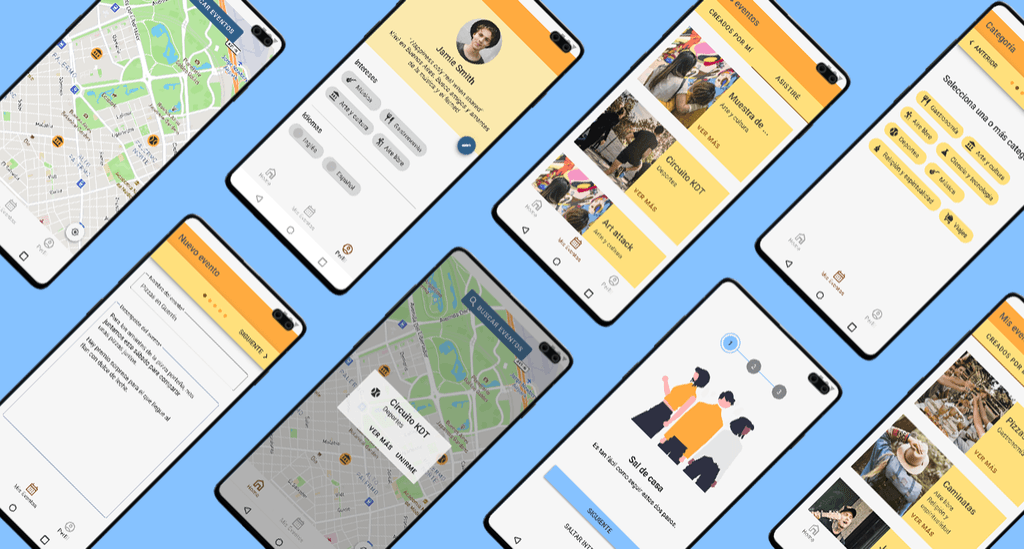
I conducted extensive UX research and created a UX report for a new app.
OVERVIEW
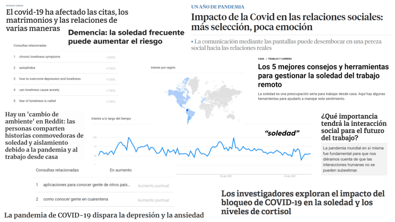
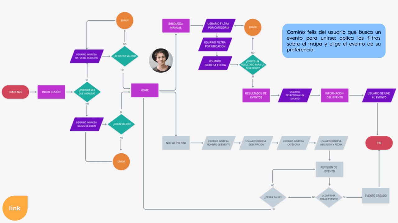
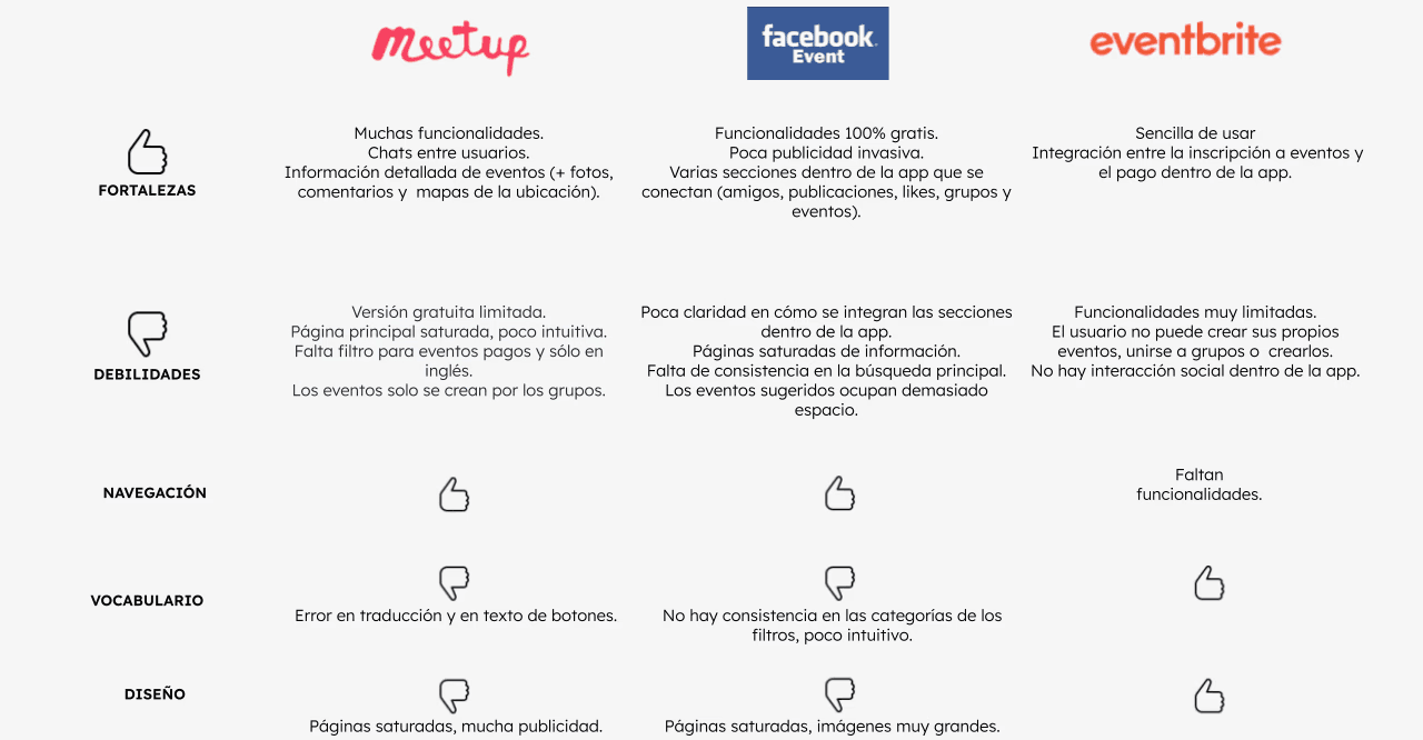
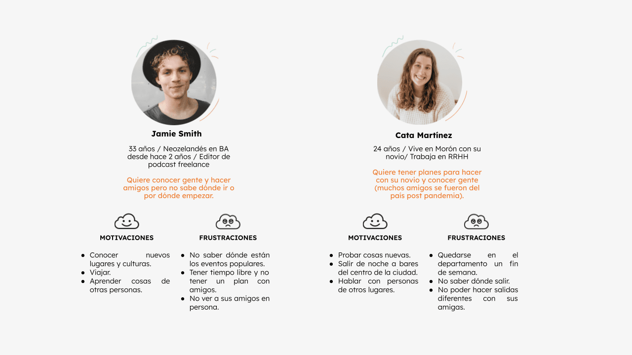
I turned a long-time idea for an app to connect with people and make new friends into reality by designing a fictional app called GOAUT. I started with market research, identifying problems, and creating user personas. Real user interviews helped improve the design. I built an MVP with core features and developed the information architecture through card sorting and user flows. I refined low-fidelity wireframes based on usability testing to ensure the MVP met user needs. The design process included creating a mood board, responsive logo, and UI kit, with a focus on accessibility. The final prototype, guided by heuristic principles, was thoroughly tested to deliver a user-friendly product.
PROBLEM STATEMENT
The challenge was to create an intuitive and accessible dating application (GOAUT) that would meet user needs in a competitive market. Despite the abundance of dating apps, users struggled to find a platform that effectively facilitated genuine connections through social events. The existing solutions were either too complex or failed to address user expectations regarding usability and accessibility. The goal was to design an MVP that prioritized user-centered design, ensuring the application was easy to navigate, visually appealing, and aligned with user needs.
MY ROLE
Initially, I established the value proposition to define the core aspects of the product, target audience, and its usage, which guided the development of the MVP. I employed various techniques to shape user profiles, conducting interviews with potential users to gather relevant characteristics and create user personas. I also developed a storyboard to illustrate the user’s journey and goals within the application.
For the information architecture, I led a card sorting activity with potential users to gather and organize category names, which were integrated into the app’s structure. On the design front, I created a mood board to set the visual direction, including colors and style. I then designed a low-fidelity version of the application, which was tested by users and evaluated against heuristic principles and accessibility guidelines.
RESULTS
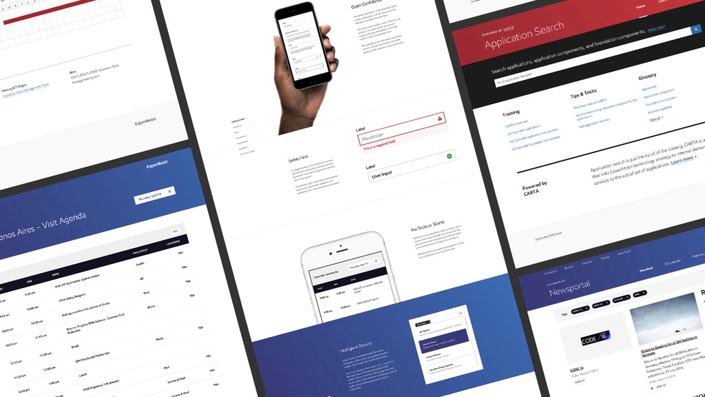
The UX report documented the project’s work, iterations, and results. It explained the design choices made in the prototype and presented findings from usability tests and interviews with clear visuals and data. The report aimed to communicate effectively, making the information easy to understand and visually appealing.
