Balancing simplicity and depth to empower users with smarter, more accessible tools for property investment.
summary
FlipSystem is a real estate company dedicated to helping people make smarter property investment decisions. Their platform guides users through every stage of the real estate journey—whether it’s buying, fixing, or flipping properties for profit.
One of the most crucial steps in this process is running the numbers to determine if a deal is worth pursuing. But here’s the catch: real estate can get overwhelming, especially for users who aren’t experienced or tech-savvy.
To address the challenge, I began with user research to uncover pain points and studied competitors for alternative solutions. Collaborating with the founders and CTO, I refined wireframes to align with the company’s vision. I then designed a high-fidelity prototype that simplified the calculator screens, making them intuitive for all users. The implemented design improved user retention and app engagement.
THE CHALLENGE
Simplifying the calculator was no easy task because, let’s face it— real estate is inherently complex. The app requires users to input accurate numbers, and mistakes could lead to terrible investment decisions, leaving users frustrated with both the app and the business.
On the flip side, we had experienced investors who knew exactly what they were doing. They wanted more—more details, more data, more flexibility.
The real challenge was finding the right balance: creating a solution that was super user-friendly for beginners while still powerful enough for seasoned investors.
We prioritized mobile accessibility, ensuring users could view, edit, and manage calculations on the go as seamlessly as on a laptop.
MY ROLE
I was deeply involved in every step of this project, from start to finish. I began with user research to understand our audience and their needs, then moved into UI design, creating intuitive and engaging interfaces. I worked closely with stakeholders, facilitating discussions to align on priorities and refining designs based on their feedback.
Once the designs were ready, I handled developer handoff, wrote detailed documentation, and stayed involved during development to address any changes or challenges. I conducted user testing, collaborated with developers on iterations, and even participated in QA testing to ensure the final product was flawless.
Seeing the calculator go live was an incredible experience. The best part? Hearing positive feedback from users as they explored and used the new tool.
The design process
The process started with in-depth discussions with the founders and CTO to understand the problem. Through collaborative sessions, I learned the fix-and-flip process, how numbers are calculated, and what defines a good investment, equipping me to begin research and align with their language.
Next, I explored our user personas to build empathy and keep their needs front and center throughout the project. I gathered feedback directly from users, uncovering their pain points and frustrations with the current experience.
From there, I went into full benchmarking mode, analyzing competitors to see what other solutions were available to investors tackling fix-and-flip projects. I evaluated their strengths and weaknesses and discussed my findings with the founders to identify opportunities we could adapt and improve upon.
Once the research phase was complete, we defined the key requirements for the MVP. I then moved into sketching and wireframing, iterating on ideas through feedback and collaboration. After several rounds of refinement, we landed on a final design that was user-tested and ultimately implemented.
OUTCOMES AND LESSONS LEArned
The project resulted in a completely redesigned web version of the calculator that allows users to input minimal data to quickly preview their results. To keep users engaged, we also integrated tasks to guide them on what to do next.
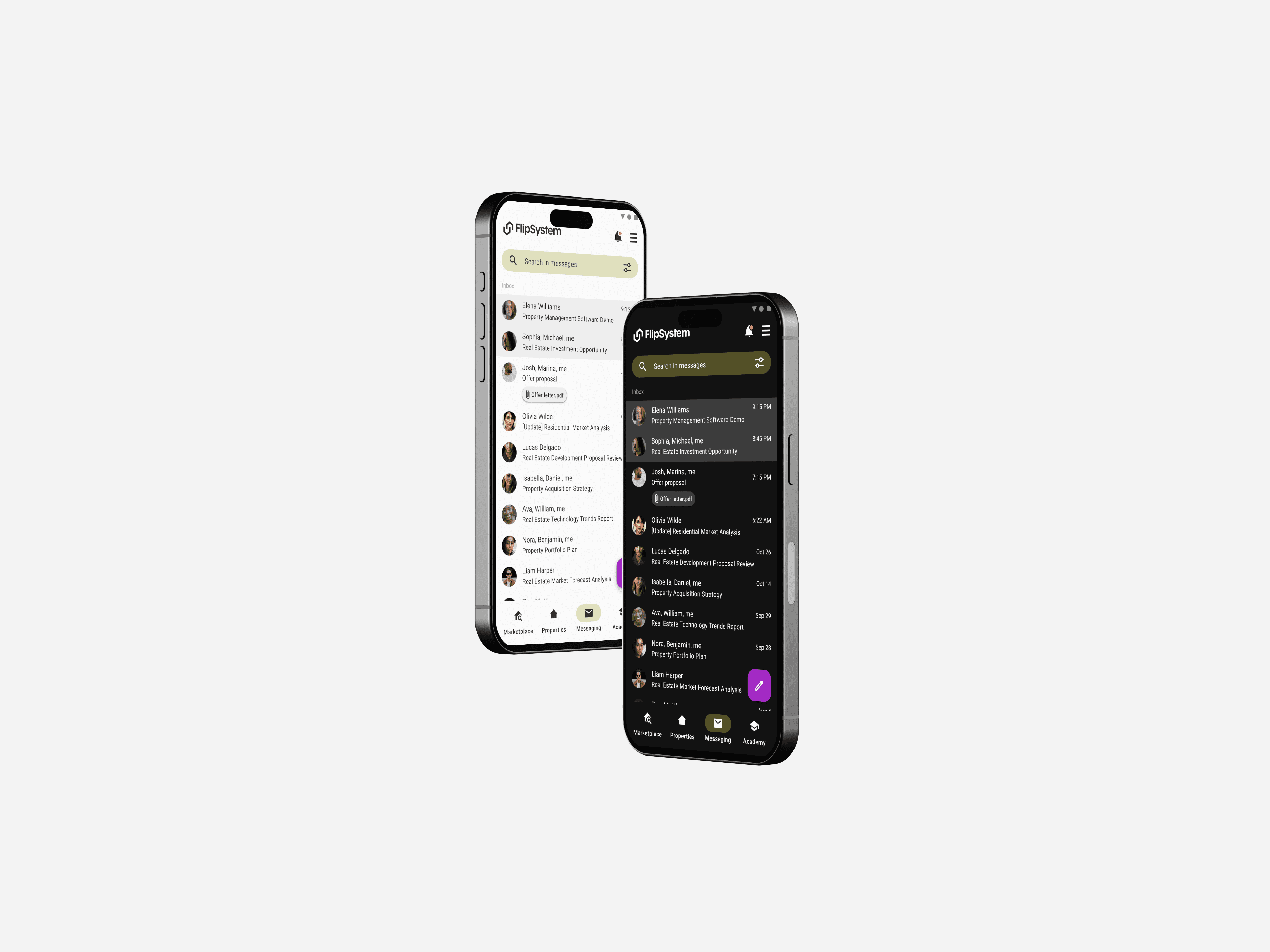
The calculator was designed to be so intuitive and responsive that it works seamlessly on both desktop and mobile. Alongside the web version, we created a fully responsive design that allows users to manage their calculations directly from their phones—ideal for on-the-go adjustments.
WHAT I LEARNED
This project taught me so much—not just about the real estate industry, its users, and competitors, but also about working closely with founders and stakeholders to tackle a challenge of this magnitude.
One of my biggest takeaways was learning how to present early ideas effectively. Initially, I wanted to focus on defining content before creating wireframes, but I quickly realized the founders needed more visual references to understand the flow. I shifted to creating very low-fidelity prototypes, which became valuable tools for discussions and saved us a lot of back and forth.
I also learned the importance of pacing the design process. Jumping into high-fidelity prototypes too early can lead to unproductive debates about colors and shapes, especially when MVP requirements aren’t fully aligned yet. Taking the time to round out the basics first helped streamline the entire process and ensured we stayed focused on delivering real value to users.


