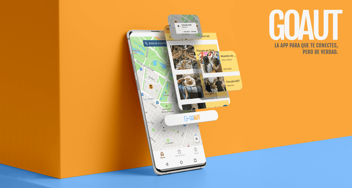
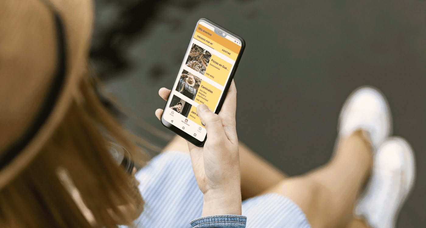
Prototype and UX research of an app to use technology as a tool to socialize and meet new people.
summary
I’ve always wanted an easier way to connect with people and make new friends. I tried different apps like MeetUp, Internations, and Facebook Events, but none of them quite offered the features I needed to have the best experience. That’s when I decided to create the app I had been dreaming about—GOAUT, an app for people to attend social events and go on dates with others.
The journey started with in-depth research, including market analysis, problem identification, and user persona creation. I conducted interviews with real people to gather insights and used them to create an MVP with core functionalities. The information architecture and user flow were refined through card sorting and usability testing, allowing me to make iterative improvements to low-fidelity wireframes. The design process was collaborative and user-centered, ensuring that the app would be intuitive and easy to use.
I designed the final prototype with accessibility at its core, following heuristic principles, and underwent thorough usability testing to ensure the best possible user experience.
THE CHALLENGE
The pandemic really changed how we connect. Suddenly, we were spending most of our time online, but the in-person interactions that help build meaningful relationships became harder to come by. It felt like, even though we were more connected digitally, it was actually harder to make real connections, and that led to a lot of feelings of isolation, anxiety, and demotivation.
That’s when I started thinking about how great it would be to have an app that could help people meet new friends, expand their social circles, or join fun group activities. The idea was to match people with events based on things like the time, location, and type of activity, so they could easily find ways to connect with others in real life.
MY ROLE
In this personal project, I wore every hat—researcher, designer, UX writer, partner, founder, and, of course, the biggest investor. I was completely hands-on throughout the entire process. After all, this was my dream: to create a product that could help people like myself feel happier and more connected to their communities.
Taking on all these roles wasn’t easy, but it was a huge learning experience, and I gained so much from it along the way.
The design process
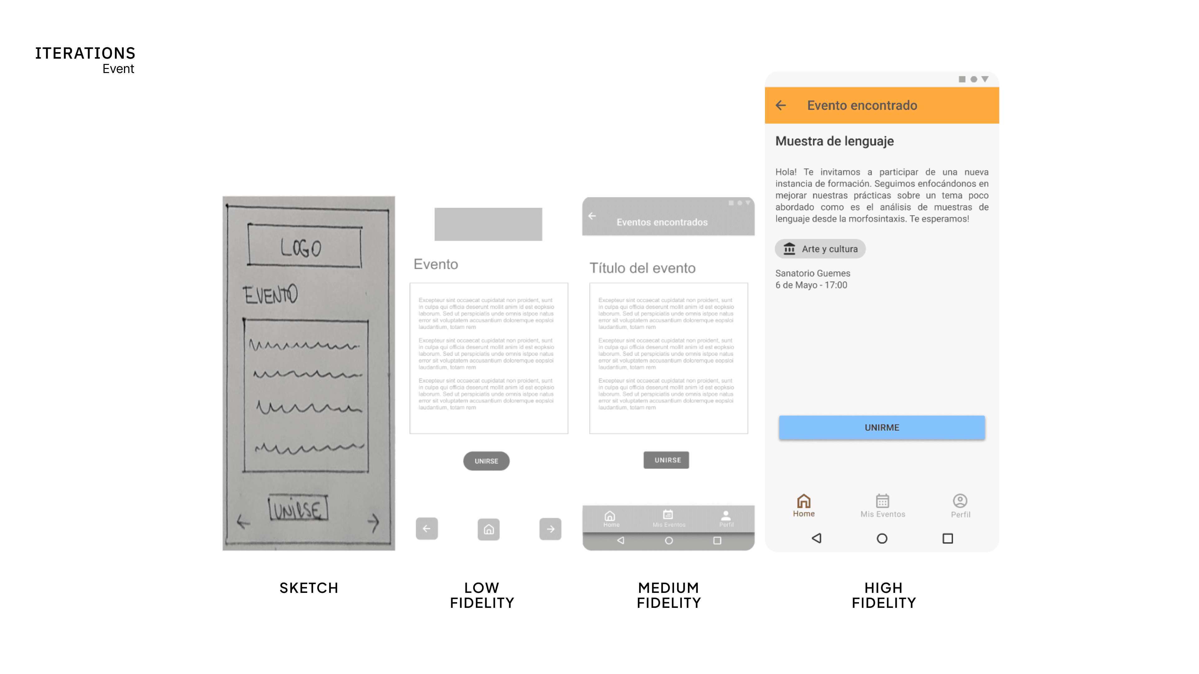
After completing UX research, where I defined the value proposition, user personas, site map, information architecture, and user flows, I started by creating low-fidelity drafts of the key screens to meet user needs. These drafts were then developed into medium-fidelity designs using atomic design principles and Material Design guidelines for Android.
The medium-fidelity screens allowed for testing and feedback, leading to several improvements. Once finalized, I worked on the color scheme, typography, and UI kit, building on the mood board and responsive logo design. The high-fidelity prototype was then iterated based on feedback from heuristic evaluations and usability testing.
OUTCOMES AND LESSONS LEArned
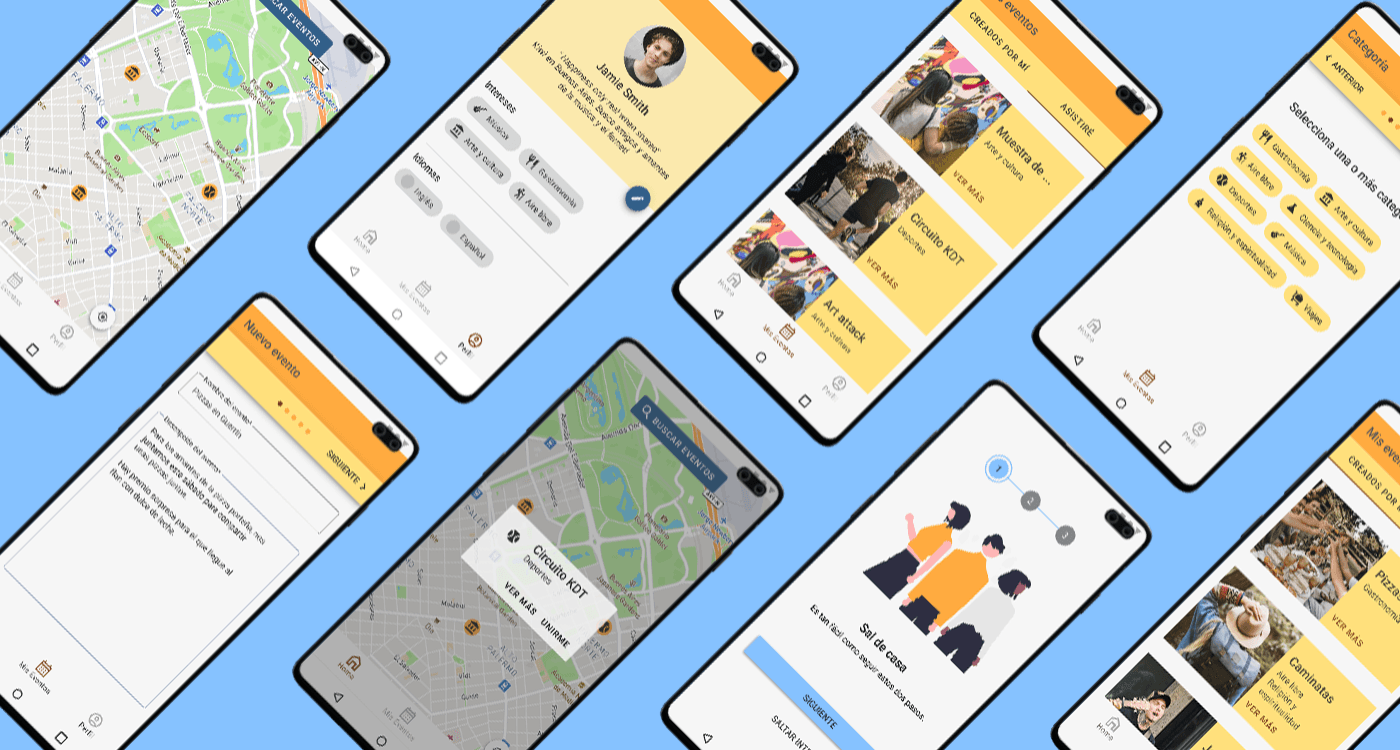
The outcome is a fully functional high-fidelity prototype that has undergone evaluations of heuristic principles, usability testing, and accessibility assessments. The prototype successfully addresses the problems identified at the beginning of the research phase and incorporates the key sections outlined in the MVP (Minimum Viable Product).


