Guiding first-time travelers through an intuitive and accessible booking process.
summary
My sister’s first solo travel adventure was a real eye-opener—not just for her but for me too. She had never booked a flight on her own before, and watching her navigate the process inspired me to take a closer look at one of Argentina’s most popular low-cost airlines, JetSmart. Her experience got me thinking:
"How could this be made easier and less stressful for first-time travelers?"
I dove into a research phase, gathering every bit of information I could find online about the booking process. From there, I identified pain points and opportunities for improvement. Armed with insights, I reimagined and redesigned the JetSmart booking flow, creating a version that feels intuitive, welcoming, and tailored to help first-time travelers like my sister have a smoother experience the next time they fly.
THE CHALLENGE
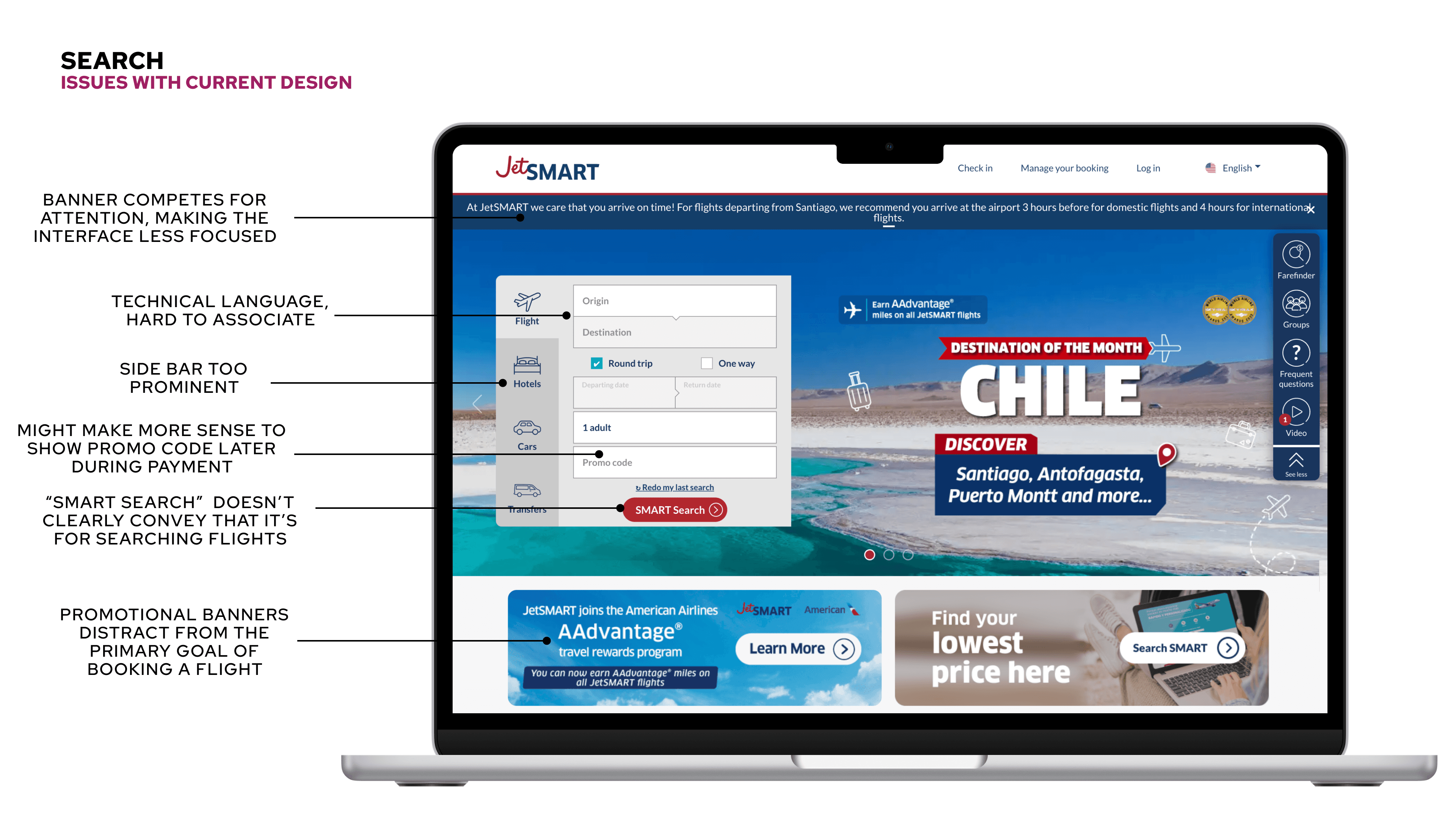
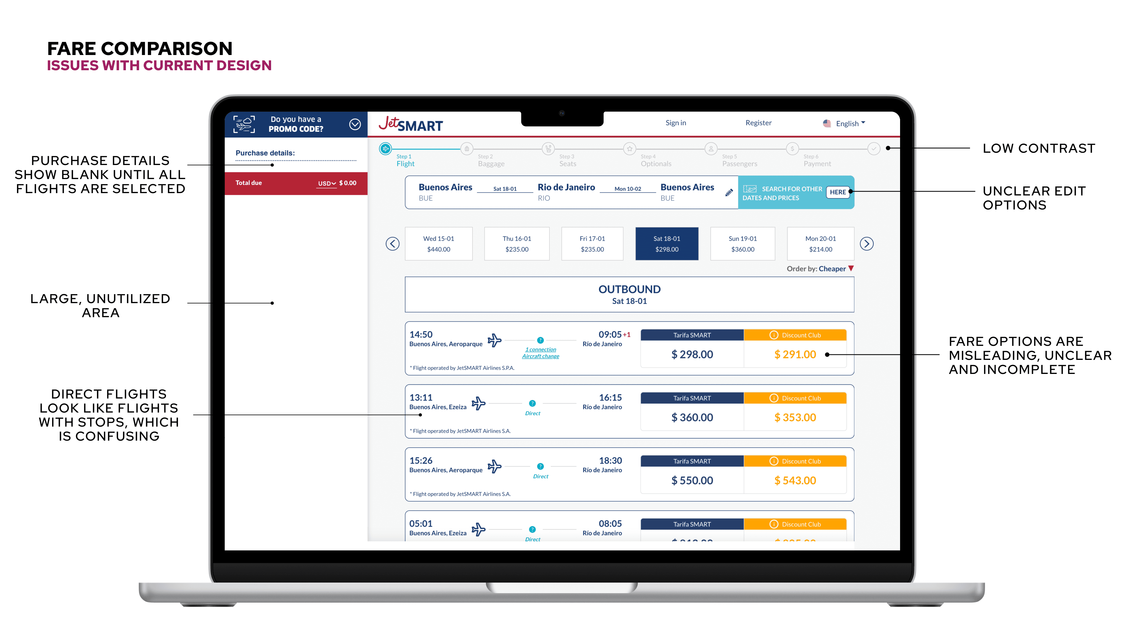
Booking a flight for the first time can feel like navigating a maze—overwhelming and confusing. It’s no surprise that many first-time users give up before completing their booking. Complex filters, unclear ticket options, and a design that’s tough to use—especially on mobile—only make things harder.
JetSmart’s current system is not clear enough for those who have never booked a flight before, and it can even be misleading. Users often find themselves unintentionally paying more for subscriptions or add-ons they don’t fully understand or need, adding frustration to an already challenging process.
MY ROLE
In this project, I took on the dual role of UX Researcher and UI Designer, which involved:
• Conducting thorough research to uncover the needs, behaviors, and pain points of first-time users navigating the booking process.
• Analyzing competitors to pinpoint industry best practices and discover opportunities for JetSmart to improve usability and stand out.
• Designing a guided, mobile-first booking flow that prioritized clarity, accessibility, and ease of use, tailored for inexperienced travelers.
• Creating wireframes, prototypes, and final designs that seamlessly addressed user needs while aligning with JetSmart’s business objectives.
The design process
For the redesign, I started by looking into what people were struggling with in the current app. I went through real user reviews on blogs like Reddit, TripAdvisor, and other places, and also did a quick usability check of the app.
To make it more relatable, I created a proto-persona based on my sister—she’s young and not super tech-savvy, which felt like a more authentic perspective than the typical “older user” you’d expect. I put myself in her shoes and thought about the features she’d really need to feel confident in making decisions.
With that in mind, I mapped out her user journey, trying to capture the emotions she’d be feeling at each step, so I could design with that in focus. Then, I did some market research, picking out four competitors: one big industry player (since they set the tone), one up-and-coming company that could shake things up, and two local competitors that someone like my sister might turn to instead of JetSmart.
Based on everything I learned, I pinpointed the areas that needed improvement, sketched out some low-fidelity wireframes, and eventually moved on to high-fidelity prototypes.
OUTCOMES AND LESSONS LEArned
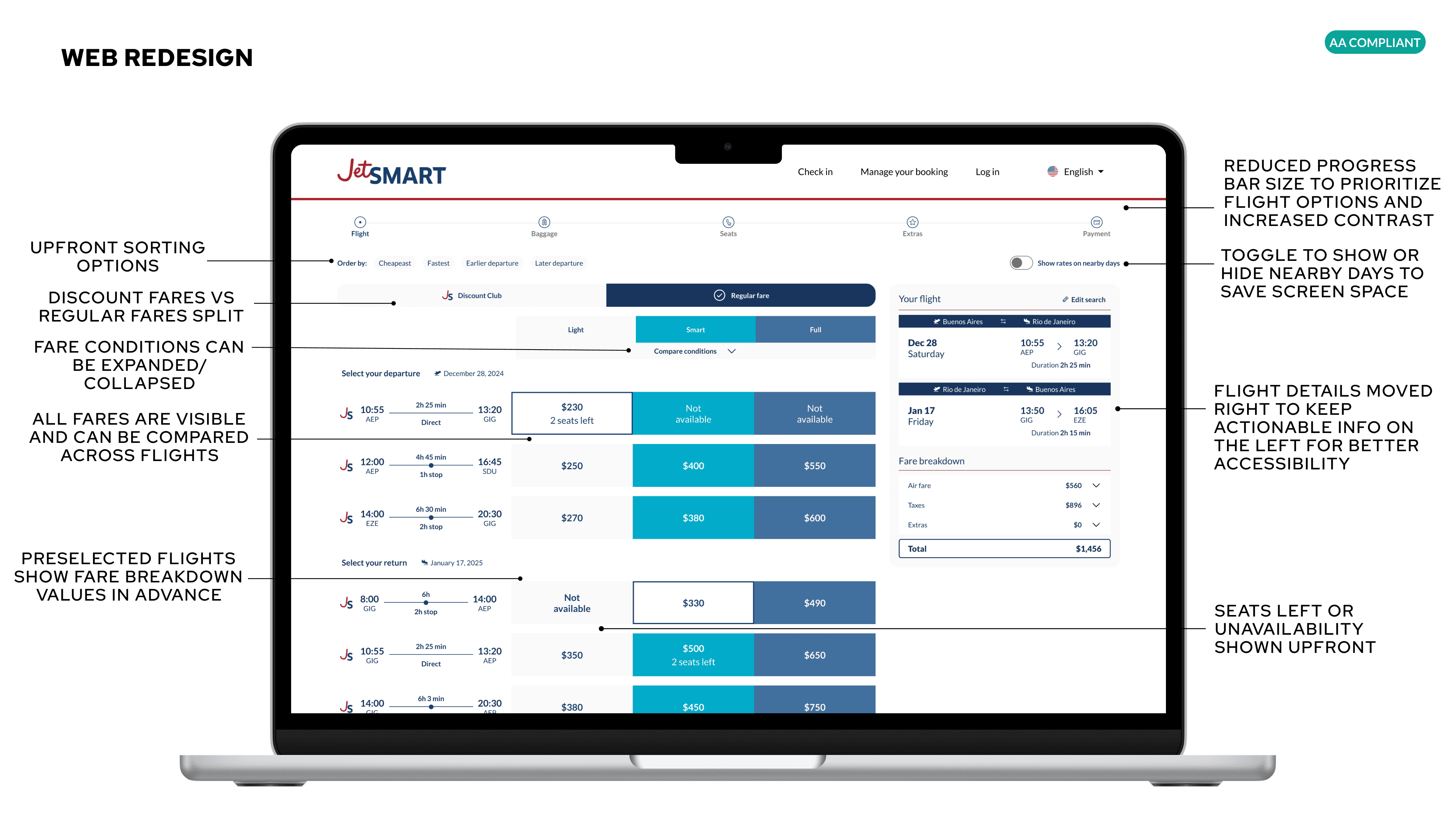
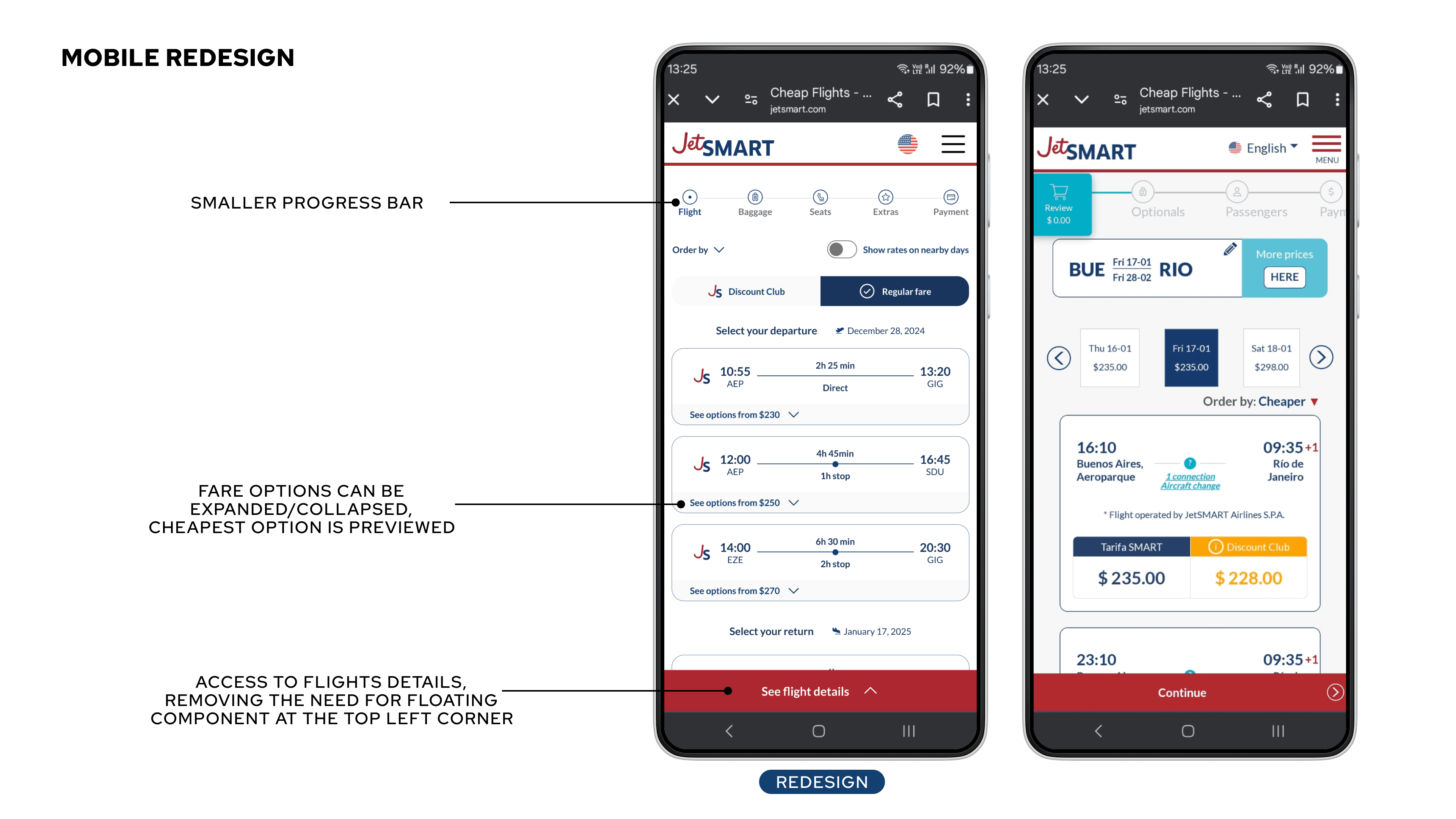
The redesigned booking system was built with first-time travelers in mind, offering a step-by-step guided flow that makes booking a flight clear and stress-free. Here’s what’s new:
• Simplified search and filters: No more confusion—users get clear explanations and smart filtering options to find what they need quickly.
• Accessible design: From high-contrast colors and larger touch targets to screen reader compatibility, it’s designed to work for everyone.
• Mobile-first responsiveness: The layout is optimized for smaller screens, with intuitive navigation that makes booking on the go a breeze.
Through this research and design process, I realized an important step: some key design decisions need to be discussed collaboratively with management and marketing. These teams often have specific attraction and revenue KPIs influencing elements like ad placement and add-on promotions.
While I might see a more intuitive design as the best way to help first-time users, the company may have valid reasons for prioritizing these features in certain areas.
I believe it’s essential to open a dialogue between Design and Marketing teams to find a balanced solution—one that meets the company’s goals while still improving the user experience. Additionally, there are likely more valid design options that could work, but real usability testing is crucial. Gathering feedback from actual users and iterating on the design before a full release would ensure a solution that benefits both the company and its customers.


