I collaborated on the redesign of ExxonMobil's corporate design system to incorporate accessibility guidelines and reviewed all the copy as the UX writer for the project.
summary
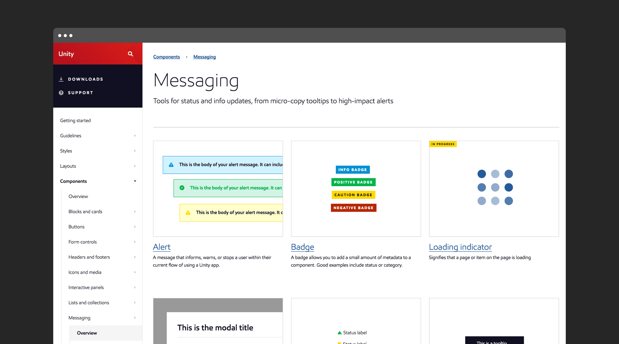
One of the largest projects I worked on as a designer was the redesign of ExxonMobil's design system (formerly called Unity, now Standard), which is accessible to over 60,000 employees across the company. In this project, my primary role was as a UX writer. I was responsible not only for reviewing the content of the design system's usage guidelines but also for incorporating accessibility-related content. This ensured that designers and developers could use the design system inclusively.
To support my team and streamline our work, I created a presentation outlining the foundations of UX writing and microcopy. This established a framework for crafting content that is intuitive, accessible, clear, and simple.
THE CHALLENGE
The redesign of Unity revealed a need for improved clarity, accessibility, and compliance with Web Content Accessibility Guidelines (WCAG). The existing guidelines lacked consistency in UX writing and accessibility considerations, making it difficult for designers and developers to create intuitive and inclusive products. The problem required a comprehensive review and update of the design system's content to ensure adherence to WCAG guidelines, making the system both effective and accessible for all users.
MY ROLE
My role in the project involved reviewing the added accessibility content to ensure a logical flow and comprehension for any user, regardless of their prior knowledge of the subject.
To align with industry standards, I analyzed the content of the most widely used design systems globally and adopted the prevalent styles for our own design system. This approach made it easier for designers and developers working with other systems to find instructions and references in familiar places, promoting a sense of familiarity.
The design process
To take on this project, I first had to dive deep into accessibility and design systems. My team and I watched videos, took training sessions, and carefully reviewed WCAG guidelines before beginning the task of revamping the corporate design system.
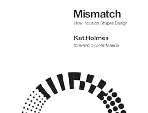
For my part, I also focused on revising the UX writing. To do this effectively, I explored UX writing, copywriting, and accessibility in UX writing. I read and highly recommend “Mismatch” by Kat Holmes and “Strategic Writing for UX” by Torrey Podmajersky. I made sure to get very familiar with the well-known design systems—not only those in ExxonMobil’s industry but also in the tech world, like Material UI, Apple Human Interface Guidelines, and Adobe Spectrum.
I also reached out to ExxonMobil’s Public Relations team to understand their communication approach. This was important to ensure that the voice and tone of the design system guidelines aligned with the company’s overall messaging. I then created a list of key writing rules and shared them with the team through a workshop, helping to avoid inconsistencies when reviewing their copy.
Finally, I reviewed the copy of the design system’s guidelines and made revisions based on these principles.
OUTCOMES AND LESSONS LEArned
The redesign of the design system was implemented and tested by users to gather valuable feedback. With a fresh name and branding, the new design system was launched as Standard. The team embraced a culture of continuous improvement, ensuring that best practices were consistently followed. This not only helped enhance the knowledge within the team but also allowed for sharing valuable insights with the broader organization.
Disclaimer: The images in this article were sourced from Google, and no proprietary content is shared.


